Numbers Don’t Lie. But Can Our Eyes?
Adapted from our post in Sparks of Innovation.
Charts are powerful things—by representing data visually, people can instantly spot trends, outliers, distributions, and other attributes that would otherwise require tedious calculations. But where does all this power come from? Much of it is from our complex visual system, which is highly tuned to recognize patterns and shapes without any conscious effort.
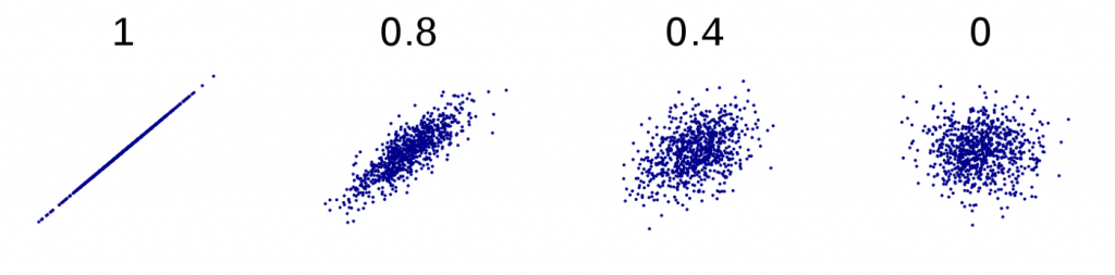
But say we are looking at a plot of two values against each other (a scatterplot) and estimating a fairly straightforward statistic: the correlation between values of x and y. Is the visual system actually estimating the x and y values of each point from their positioning, summing those values, estimating the number of points and dividing the sums by that number to get means, subtracting those means from each value, then multiplying the differences to… Well, you get the idea. The answer is: probably not. So what is it actually doing?
Explaining Perceptual Proxies
This is where the idea of perceptual proxies comes in. More likely than the above scenario is that the correlation of the data affects simpler properties of the plot when it is viewed, holistically, as a kind of shape, or “blob.” Our vision system uses these properties as stand-ins, or proxies, for the statistic we are trying to estimate. For example, scatterplots of highly correlated data appear more as long, thin lines or ovals, while those of uncorrelated data appear more round and dispersed.
If the visual system really is taking shortcuts, it should be possible to catch it in the act. The problem is, in most cases and for normal data, these shortcuts seem to be pretty good ones: they correspond well with the real answer, and so we are none the wiser. But what if we constructed our data in a more “adversarial” way, making those simpler attributes deviate from the true statistic? Could we fool the visual system? In this project, this is exactly what we set out to do.
Getting Your Eyes to Lie
Rather than correlation, we chose two simpler statistics to test: mean (average) and range. Here we’ll focus on the mean for simplicity’s sake. We showed people pairs of bar charts and asked them which had the bigger mean. Unbeknownst to them, we were trying to sabotage this estimation by controlling a variety of perceptual proxy candidates that we were testing. Below is an example. Note that we randomly vary the thickness of the bars to throw people off, or else the total colored area would give away the answer.
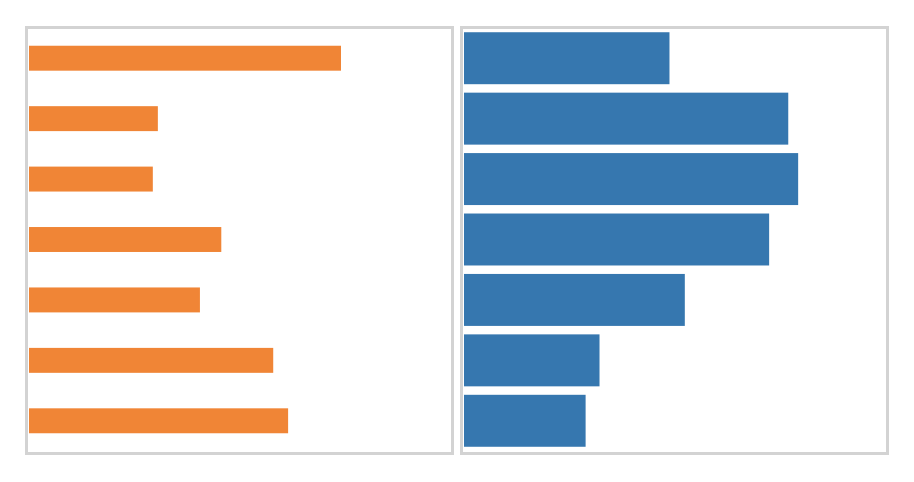
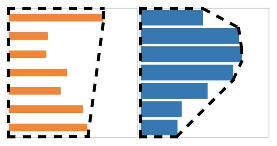
In the figure above, the blue chart on the right has the larger mean, but the orange chart has a larger “convex hull” area. The convex hull is conceptually like wrapping a rubber band around the bars and taking the entire area inside it, as shown below.
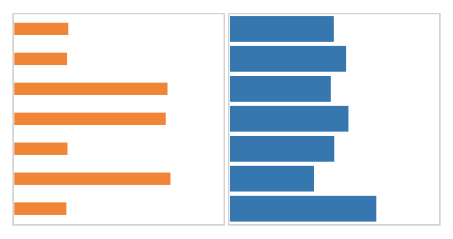
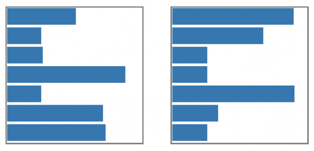
The strongest evidence we found for a mean estimation proxy, however, was not for the convex hull, but for the centroid. Think of a centroid as a center of mass, or the point you could balance the chart on if you cut its shape out of a thick sheet of paper. We predicted that the horizontal position of the centroid could be used to estimate mean. Adversarial charts with “large” (or very rightward) centroids, compared to their means, look like the orange one below: they have a distinctive spikiness, with about half the bars being very short and the other half being long. The blue chart, in fact, has a slightly higher mean. Would you be fooled?
Starting from Scratch
A downside of our approach is that we needed to come up with proxies to test in advance, but the whole point is that we are not sure what proxies people use. The best we could do was speculate and try our best guesses. But what if, instead, we tried to get proxies to emerge naturally from random data, guided by human perception? To get this to happen, we no longer needed to sabotage people with proxies, but we did use another bit of trickery: we asked people which of two charts had a higher mean, when in fact the means were identical. The winner of this face-off was then pitted against similar charts, and so on. After many rounds, we should, in theory, have a chart optimized for deception. So what did these deceptive charts look like? Two examples for the “bigger mean” task are shown below.
Look familiar? They exhibit a “spikiness” very similar to the charts that we intentionally modified to have higher centroid proxy values. And if we compute the centroids of these charts, they are indeed much higher than would be seen in random charts. This is a pretty exciting complement to the results of our first experiment, where we were able to trick people into picker charts with bigger centroids instead of bigger means.
Of course, there are some caveats to these results. First, there were other “winning” charts that did not exhibit this spikiness, which could be because they have some other proxy we have not thought of, or just because there is noise in the process. Second, when we actually put these charts to the test, people did not consistently choose them over random charts. Clearly, there is still a lot of work to be done to cement our understanding of these proxies, and this is just for a couple tasks and just using bar charts. All told, though, we think this research is at least a small step forward in the march toward understanding how vision enables data visualization, and how to make those visualizations more effective.
More Information
Ondov BD, Yang F, Kay M, Elmqvist N, Franconeri S. Revealing Perceptual Proxies with Adversarial Examples. To appear in IEEE Trans. Vis. Comput. Graph. 2020. (Pdf)