A Moment of Reflection: How Symmetry Can Help Us Interpret Charts
By Brian Ondov and Niklas Elmqvist

Symmetry has a long history of study in perceptual psychology, from the Gestalt movement to modern, computerized experiments with flashing point clouds. Researchers have even tested whether this basic element of visual organization is still perceived by astronauts in microgravity (it is!). Much less studied, though, is how our innate ability to recognize symmetrical shapes and scenes might affect how we see data in visualizations.
Perhaps recognizing the power of symmetry intuitively, demographers have long used it to juxtapose the male and female components of population pyramids, beginning in the late 19th Century. Here at the HCIL, though, we arrived at symmetry from a somewhat different angle, while tackling the problem of how to compare two sunburst charts. Nonetheless, we saw an opportunity to provide more experimental evidence for the technique (and, in fact, for comparative displays more generally).
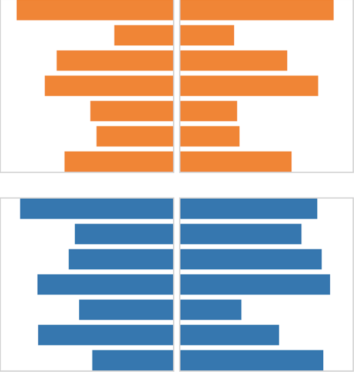
We asked two main questions: (1) does symmetry help pick out a “biggest mover” between two datasets (top, left), and (2) does it help identify overall similarity (top, right)?
The results were promising: for the first task, the symmetrical arrangement indeed allowed participants to identify more accurately which bar changed the most, compared to a typical side-by-side view. This supports the idea that we can see not only whether a shape is symmetrical, but also which parts are or are not. Symmetry, though, was not the top performer here—the task was even easier using a superimposed display, and easier still with animation instead of two static views (the latter was a pleasantly incidental finding).
Where symmetry really shined, though, was in the second task, involving overall similarity. Here, the symmetrical arrangement outperformed all others, including superimposing and animating. This is perhaps not so surprising, given what we know about perception. After all, when arranged in this way, more similar data sets will create more symmetrical shapes. Still, this provides some empirical evidence that had been missing, which is pretty exciting for those of us that traffic in data. On top of that, as you may have noticed, the charts in this task look a lot like the population pyramids mentioned earlier. This is a nicely mutual validation (a symmetry, if you will): it’s both experimental support for a long-used technique and practical corroboration of our controlled experiment.
Of course, these were very focused studies, with the number of variables intentionally limited. In the future, we can ask a host of other questions to tease out where, when, and why symmetry works—and doesn’t work—in data visualization. Naturally, the technique will not be appropriate for all situations, especially if more than two datasets need to be compared. If nothing else, these results have given us something to reflect on.
More information about this work:
To learn more, contact Brian Ondov at ondovb@umd.edu.
For video and demos, visit: //visualcomparison/
To learn more about the HCIL, please visit: //