Face to Face: Evaluating Visual Comparison
Brian Ondov1, Nicole Jardine2, Niklas Elmqvist1, Steven Franconeri2
1HCIL, 2Visual Thinking Lab, Northwestern University
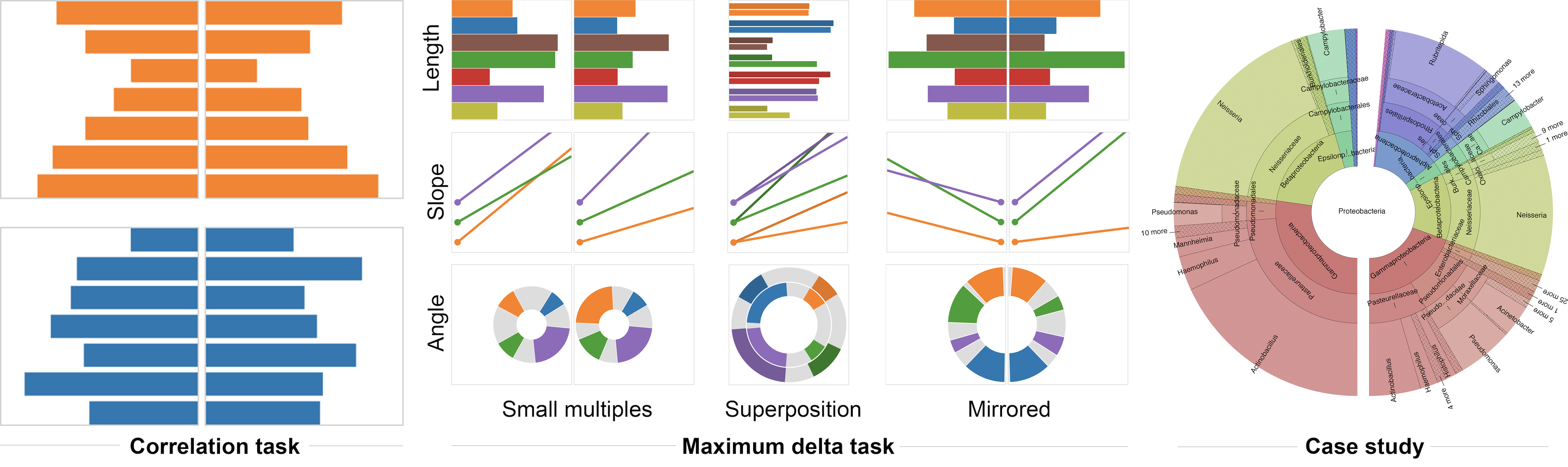
Figure 1– Evaluation methods for visual comparisons. Left: Participants were asked to pick the most similar pair of bar charts for a variety of arrangements and degrees of correlation. Center: Participants were asked to find the maximum delta, or “biggest mover” between pairs of datasets. Right:A case study with biological domain experts using Krona.
While there are many ways to represent data graphically, experimental evaluation has shown us that not all representations are equal. Choice of stimulus (e.g. length, angle, area, or color) can have a large impact on basic perceptual tasks, like estimating quantities. When comparing more than one data set, however, the goals of the visualization can be fundamentally different. For example, instead of looking for the largest or smallest data point, we may look for the largest delta from one set to another or for an overall level of correlation. While many lessons learned from single series no doubt extend to multiples, introducing comparison adds additional complexity and potential variables.
We thus build on prior evaluation studies with a series of crowdsourced experiments designed specifically to evaluate layouts for visual comparison. Participants performed two primitive tasks: (1) identification of a maximum delta, or biggest mover, between data series (Fig. 1, center) and (2) estimation of overall correlation between two series (Fig. 1, left). For each of these, we explore performance of 5 layouts: (i) horizontally arranged small multiples, (ii) vertically arranged small multiples, (iii) superposition, (iv) mirror symmetric small multiples, and (v) animated transitions. The first three of these are commonly used and are associated with intuitive—but rarely measured—differences in efficacy. The final two are less common but may leverage particular sensitivities of the visual system, namely motion and symmetry, making them valuable to study.
Confirming prior intuition, we observe high levels of performance for superposition versus standard small multiples. However, we also find performance improvements for both mirror symmetric small multiples and animated transitions. While these results are somewhat incongruent with common wisdom in data visualization, they align with previous work in perceptual psychology, and thus have potentially strong implications for visual comparison designs. To generalize this work to a more realistic setting, we also present a case study of applying both animation and mirroring to Krona, an interactive sunburst browser (Fig. 1, right).
Try the experiments
(results won’t be submitted!)
Contact:
Brian Ondov – ondovb@umd.edu
Niklas Elmqvist – elm@umd.edu
Nicole Jardine – nicole.jardine@northwestern.edu
Steven Franconeri – franconeri@northwestern.edu
Data: http://cs.umd.edu/~brianond/face2face_data.zip
Publications
- Ondov, Brian, Nicole Jardine, Niklas Elmqvist, and Steven Franconeri. “Face to Face: Evaluating Visual Comparison.” IEEE transactions on visualization and computer graphics (2018).